Understanding Point Sizing and Font Characteristics
View the full library of accessibility solutions.
Point rather than pixel size is the unit of measure WCAG 2.0 refers to when considering contrast. Points and pixels do not equate 1:1. In fact 14pt is 19.2px.
This means that a 14px bold font will actually fail contrast requirements if the contrast falls below 4.5:1; while a 19.2px bold font will just pass the 3:1 requirement.
| pt | px | em* | 4.54:1 | 3.11:1 | 2.96:1 | Arial | Verdana | Tahoma |
|---|---|---|---|---|---|---|---|---|
| 12pt | 16px | 1em | Pass | Fail | Fail | Sphinx | Sphinx | Sphinx |
| 12pt | 16px | 1em | Pass | Fail | Fail | Sphinx | Sphinx | Sphinx |
| 14pt | 19.2px | 1.2em | Pass | Fail | Fail | Sphinx | Sphinx | Sphinx |
| 14pt | 19.2px | 1.2em | Pass | Pass | Fail | Sphinx | Sphinx | Sphinx |
| 18pt | 24px | 1.5em | Pass | Pass | Fail | Sphinx | Sphinx | Sphinx |
*this em measurement is relative to browser default
Same size, different properties
Font size is an inexact science when it comes to readability.
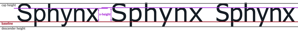
The image above shows the same word written in Arial, Verdana, and Tahoma. These three words are the exact same font size and the same cap height and descender height. Yet they vary in:
- lower-case height (x-height)
- height of their ascenders
- width of the letters
- spacing between the letters
Additionally, fonts with the same weight can have very different thickness in the letter stroke.
These differences can make the same font size more or less readable to someone with low vision.
| font-weight | typeface weight | <10.5pt (<14px) |
≥14pt (≥19.2px) |
≥18pt (≥24px) |
|---|---|---|---|---|
| 100 | Extra Light, Ultra Light | do not use | do not use | do not use |
| 200 | Light, Thin | do not use | do not use | do not use |
| 300 | Book, Demi | do not use | do not use | 4.5:1 |
| 400, regular | Normal, Regular | 4.5:1 | 4.5:1 | 3:1 |
| 500 | Medium | 4.5:1 | 4.5:1 | 3:1 |
| 600 | Semibold, Demibold | 4.5:1 | 4.5:1 | 3:1 |
| 700, bold | Bold | 4.5:1 | 3:1 | 3:1 |
| 800 | Black, Extra Bold, Heavy | 4.5:1 | 3:1 | 3:1 |
| 900 | Extra Black, Fat, Poster, Ultra Black | 4.5:1 | 3:1 | 3:1 |